Enhance the protocol workflow for medical radiologists
Role: UX Design, Interaction, Visual Design, Research
Company: Hologic - Medical Device Company
Team: 1 UX Designer, 1 Product Owner, 3 engineers
Challenge: Improve the protocol workflow for medical radiologists.
Timeline: 6 months
Background
Within the context of the medical device, a Protocol is an automated process that guides the user through a series of steps to perform an exam.
In order to run a protocol on the Mach system, a protocol definition file must be created and configured. This protocol definition file will contain all information necessary to create the different steps which compose a specific ultrasound exam.
Problems
The system only displayed a default protocol, limiting technologists' ability to perform their tasks and potentially extending the time required to complete them. Additionally, standardizing the exam within a common workflow proves challenging.
Capture the user insights
When the project began, I closely collaborated with the Product Owner in the team. To gain deeper insights, we recognized the need for additional research. Then I conducted a workshop involving stakeholders and application technologists to develop a mental model that captures users' habits and needs when utilizing the protocol. The entire team collaborated to dissect insights, categorize them, and shape the mental model. This process included:
Understanding user pain points.
Identifying day-to-day tasks that require completion.
Determining user requirements from the protocol.
Capture the insights
I found the most frustrating phase in the mental model operating the protocol is when:
Synthesize business goals & user goals
I gathered the business goals from the project briefing and extracted user goals from both the user research and my analysis report. Using this information, I identified the commonalities between the business and user goals. Additionally, I integrated technical considerations, as they constitute the third essential aspect of product development, alongside business and user-centric design.
Solutions
Design requirements
After coming up with the crucial features, we analyzed the data from the workshops and drew key insights. To synthesize these insights effectively, we utilized spreadsheets to dissect the features according to user needs. As the Product Owner gains a better understanding of the system, we sat down together to prioritize and broke down the features. This process facilitated the creation of design requirements, which in turn aided me in constructing the information architecture for the application. This involved tasks like crafting a sitemap and establishing user flows.
Build information architecture
After defining the distinct features, I organized the content architecture based on the priorities of the product roadmap. Subsequently, I mapped out the information architecture to determine which elements belong to each page.
Map out the user flow
When I had the structure of each page, I created a user flow that guides them through various scenarios. During this phase, I collaborated with the Product Manager and engineers to map out the user flows and understand the multi-step interactions before proceeding to the wireframing stage.
Start with low fidelity wireframes
I generated numerous ideas through sketches and collaborated with my product owner and engineers to brainstorm various possibilities. Subsequently, I translated these concepts into low-fidelity wireframes. I organized each wireframe into groups and added annotations based on the user flows I had mapped out. This streamlined presentation allowed for easy communication with the team.
Building upon the existing design, I propose presenting the protocol as a table, complemented by additional information. This approach would enhance users' ability to navigate and explore the data effectively. Moreover, this design not only ensures scalability but also assists users in refining their search results accurately.
Create a protocol
Create a step
Create a step from an existing protocol
Import/Export
Search
Expert feedbacks
To ensure the feasibility of the design, I engaged in close collaboration with engineers during the ideation phase to validate all proposed designs. The development team provided valuable feedback from a technical standpoint, which led to the identification of additional scenarios for error prevention. Subsequently, I presented the design to stakeholders, engineers, and Key Opinion Leaders (KOLs), seeking feedback from a business perspective. Here are some key insights that emerged after sharing the design with the team:
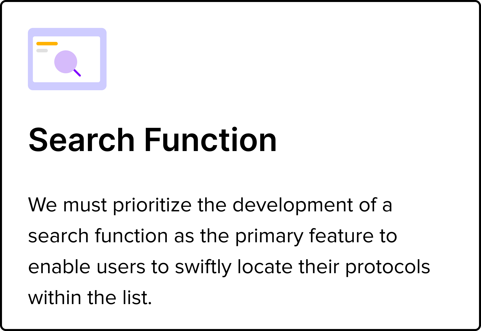
Given the users' requirement to refine their data within the table, it's crucial for the design to include an advanced search functionality. This feature should empower users to query the data using specific parameters such as date, steps and name.
The search bar should have a prominent placement, as users frequently rely on it for quick navigation.
In addition to the basic export feature, the design should also accommodate customized export options. This enables users to select specific columns from the table for export, facilitating more focused data analysis.
Iteration
Based the feedback from the team, I engaged in iterative design processes, creating another version that emphasized the Search function and Import/Export features.
Multiple searches
Recognizing the significance of the search feature on the page and the need for expanded functionality, I enlarged its size.
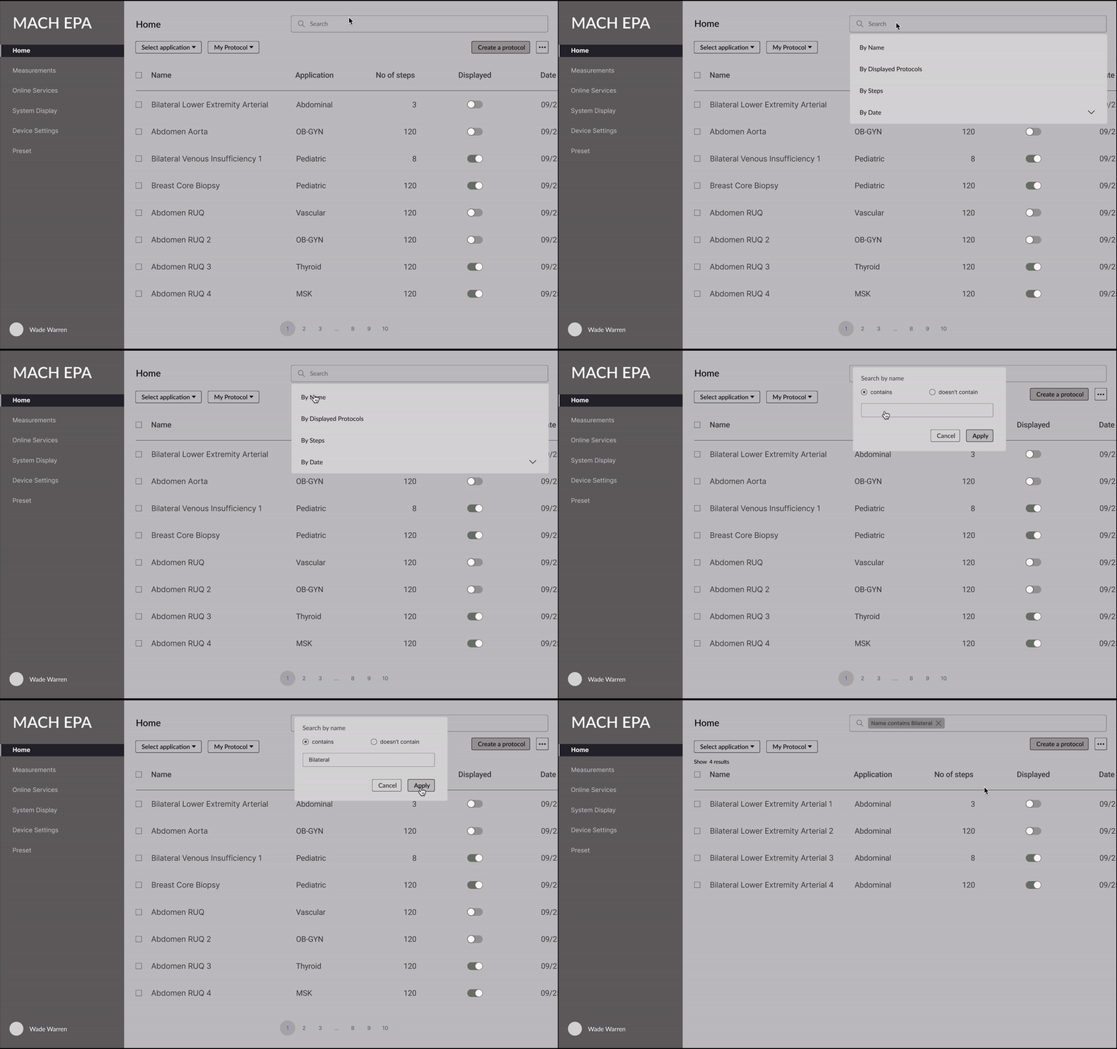
Additionally, in order to optimize performance, we have agreed that targeting specific aspects during a search at a time would lead to better results in the table. When users engage with the search function, they are presented with the option to select the multiple searches they intend to perform.
Here's example of the flow when a user opts to search by name:
User selects the "Name" option from the search dropdown > >This action triggers a popup that asks whether they want to include or exclude specific keywords > > Once the user provides their choice and clicks the "Apply" button, the table is narrowed down based on their selection.
Import and export function
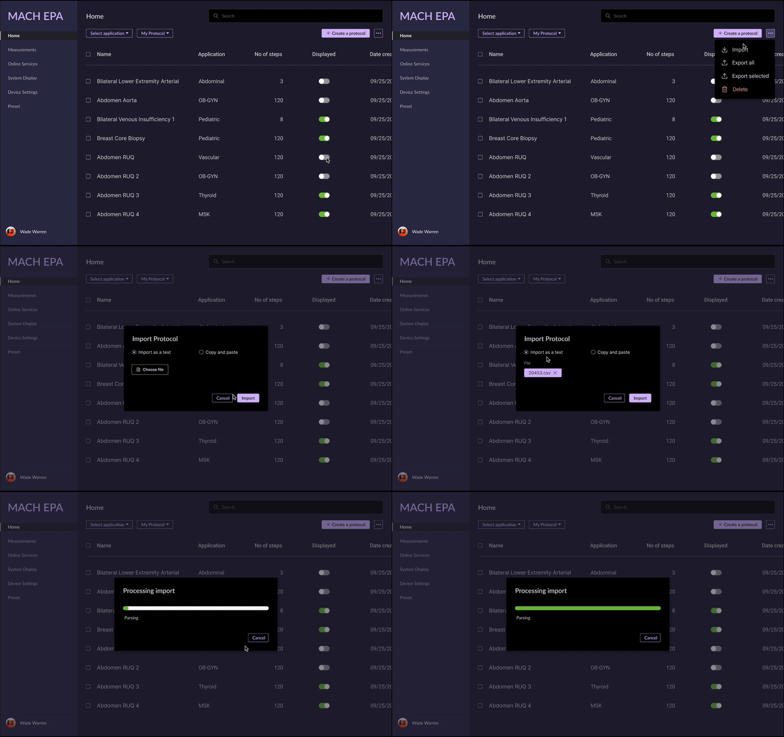
I have placed all functionalities, including Export, Import, and Delete, under the 'More' icon for the sake of scalability. In order to prevent project scope creep, we have deprioritized this feature and decided to hold it for the next version.
Design system
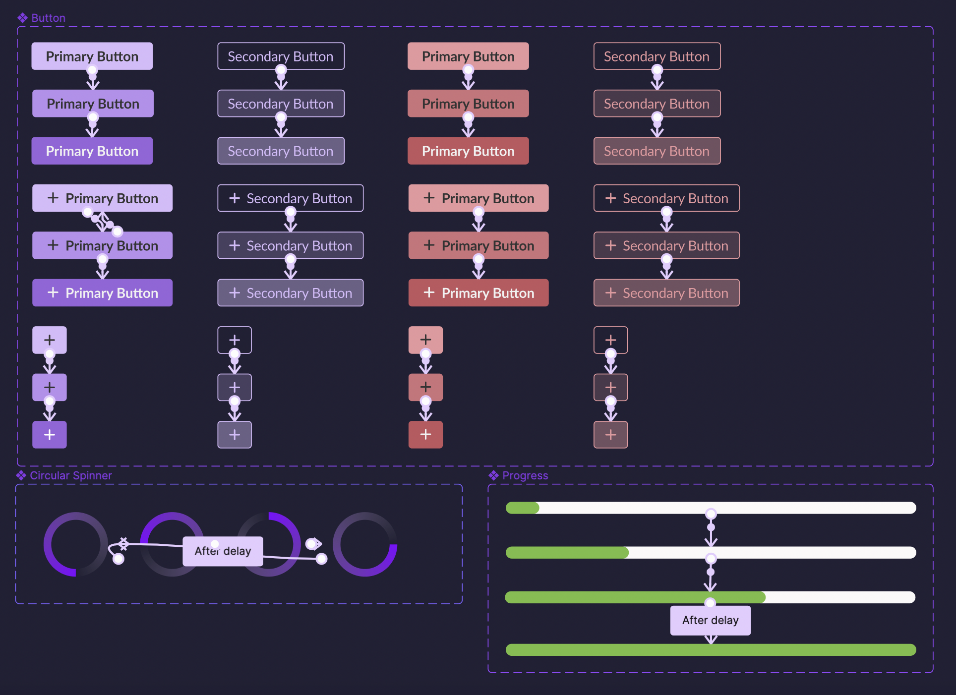
Even though the product had a style guide, upon inspecting the entire component inventory, I found inconsistencies among them. Therefore, I assisted the team in organizing the components, carefully comparing each one to the style guide to ensure uniformity. Since users interact with the application in dimmed light and most of the design is in dark mode, it's essential to ensure that the colors don't have excessive contrast. Using lower saturation can help alleviate strain on users' eyes.
To save time during the prototype building phase, due to the numerous screens involved in each interaction, I used Figma to create the flow for each component. This approach aided in reducing the number of screens within the flow.
Final design flows
After finalizing the concept using low-fidelity wireframes, I proceeded to apply the established visual design to the final version. It was essential to ensure the utilization of the color palette from the system to maintain consistency throughout the product.
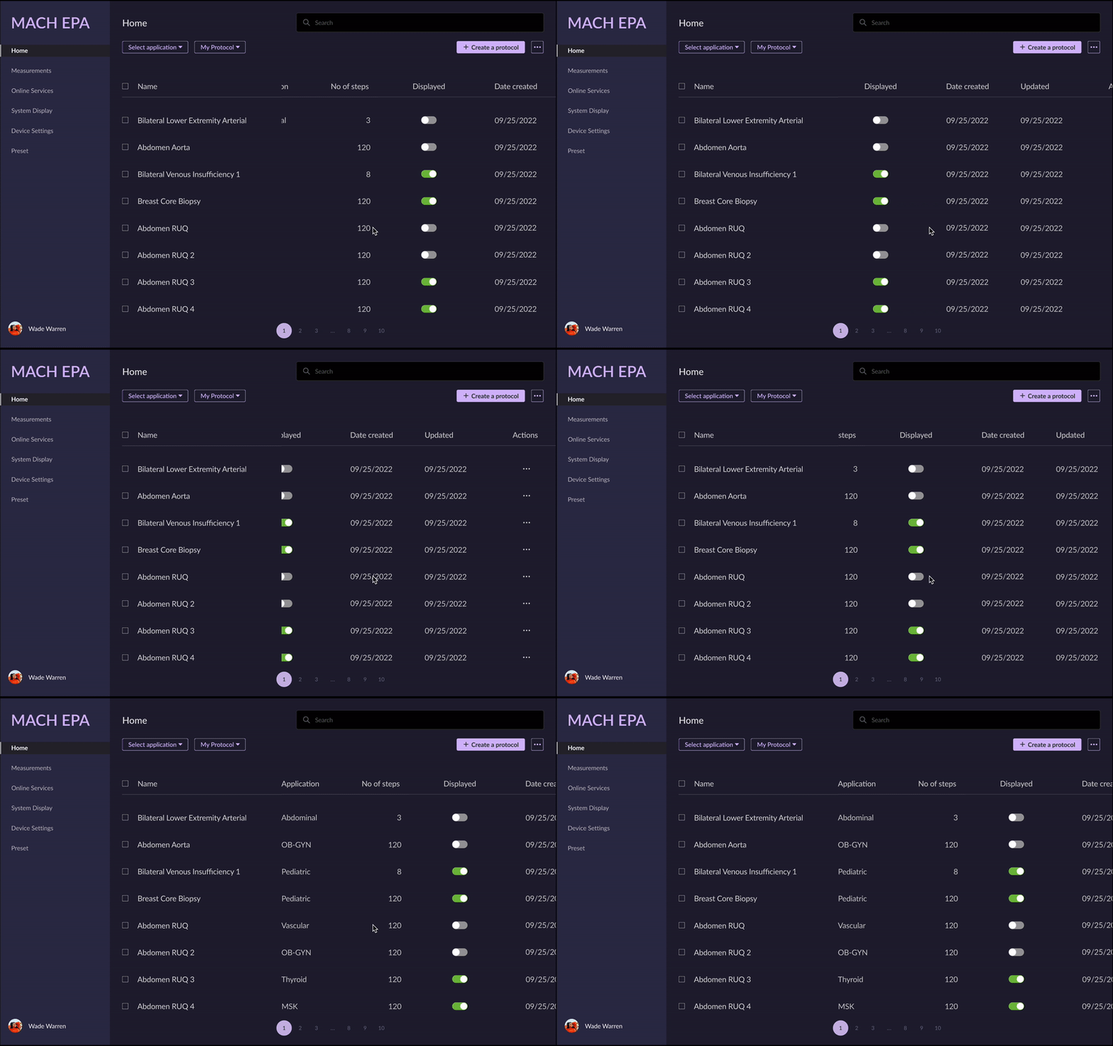
Tabular experience
The protocol is displayed in a table format where the first column remains fixed, while the other columns are horizontally scrollable.
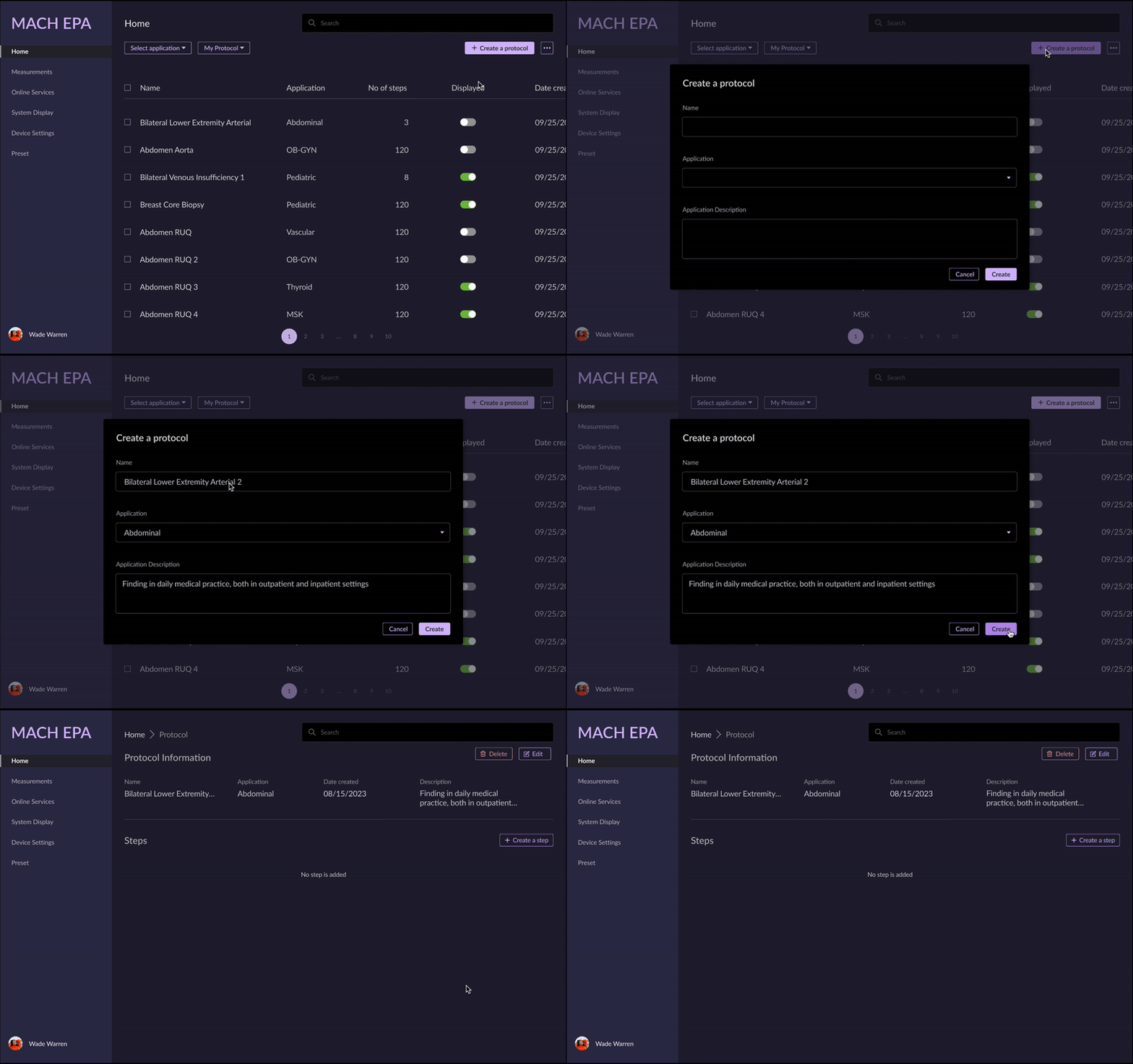
Create a protocol
Popup will be open for users to create a new protocol. The information is included in Name, Application and description. When create a prototype, it will navigate to protocol page which include its information. Inside there will be steps for users to add
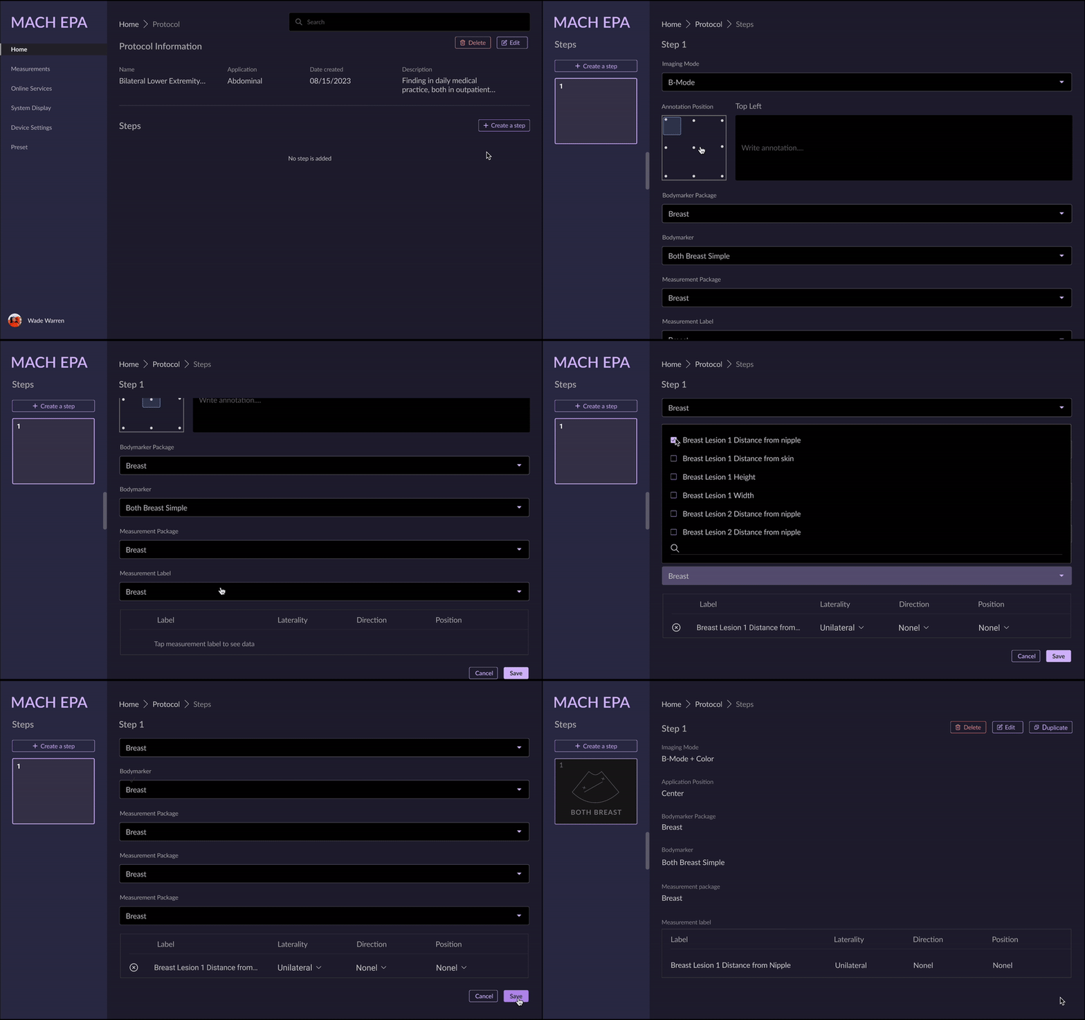
Create a step
When create a step, left navigation will change to step list for its scalability. After filling the information in the form step, users click on Save to change to View mode.
Scrolling steps
The protocol can encompass numerous steps, and this screen illustrates that users can vertically scroll through multiple steps on the left navigation.
Multiple searches in the table
To optimize the search results, users can select the desired filter during their search and then further narrow down the results by drilling down into keywords associated with that particular filter.
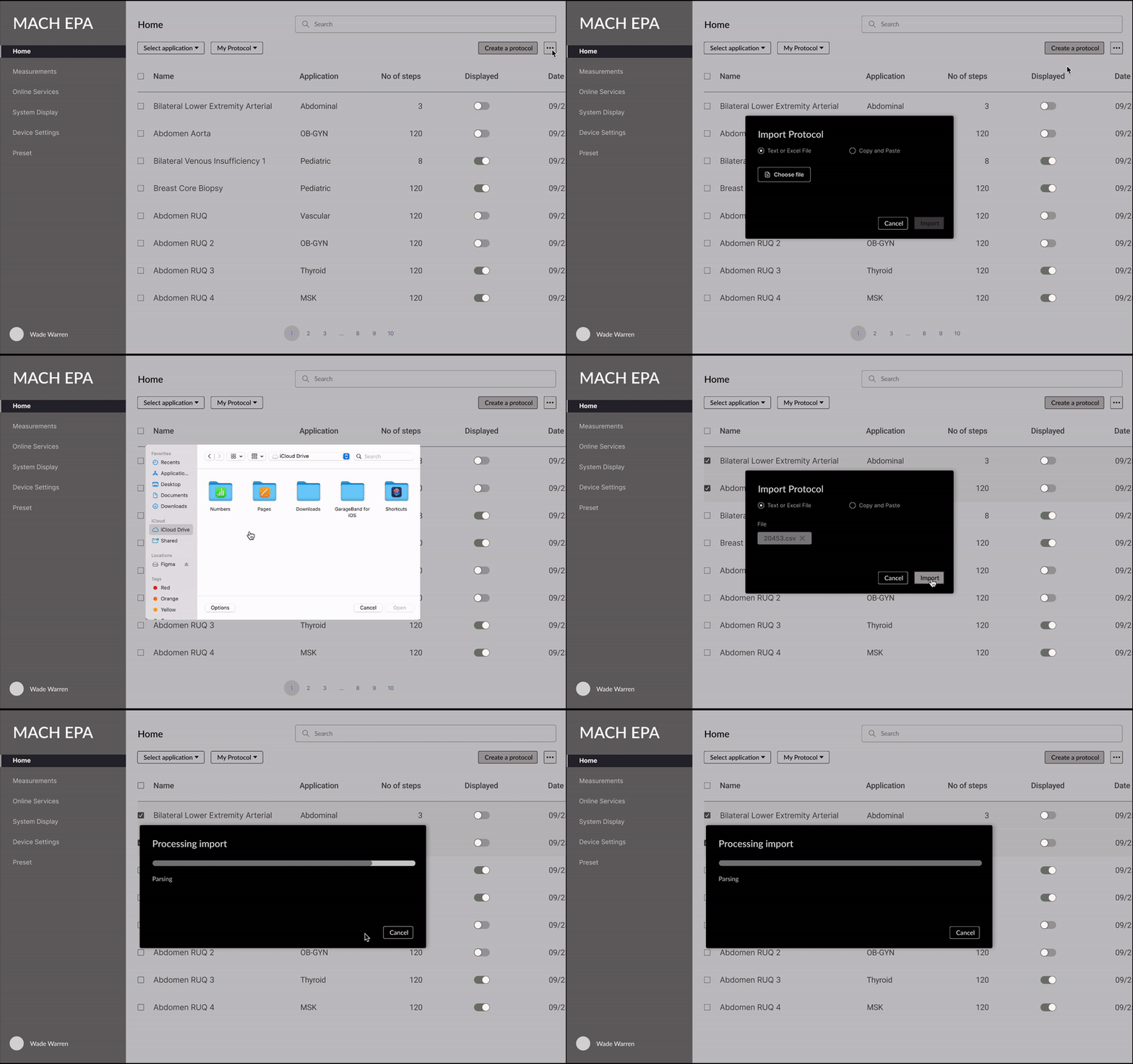
Import protocol
Users can import the file as text by either selecting it from their local computer or copying and pasting it into the designated pop-up. Once users choose the desired format and select the file, this action will trigger the processing and import status.
Export protocol
Select the row to be exported, then click on Export to trigger the popup to ask which format users would like to export to Download folder.
Conduct usability testing
After multiple rounds of prototype review with the team, we reached a consensus to proceed with usability testing to validate our design assumptions. By conducting this test, I was able to observe users interacting with the web application, enabling me to gain insights into their thought processes and understand why certain aspects that seemed clear to me were actually confusing or frustrating for them. Then I recruited 5 participants to test my prototype.
Overall Test Completion Rate: 100%
Overall Error Free Rate: 80%
Positive feedbacks on the homepage:
1. Participants really liked the structured protocol presented in table format, with more details on each protocol, and understanding how the toggle indicates how the protocol will be displayed on the monitor.
2. Participants knew how to use the search function to drill down into the protocol and truly appreciated its assistance in navigating to the correct protocol.
In addition to the positive feedback, I gathered some valuable insights from the testing, which have helped me iterate on another version.
Problem 1: Back button
Participants attempted to use the browser's back button to return to the previous page instead of relying on the breadcrumb trail to navigate back to the protocol. Three participants also attempted to find the navigation back option within the left navigation.
Problem 2: Scrolling is a pain
Participants provided feedback that scrolling to find a step would be difficult for them, especially when there are more than 100 steps.
Problem 3: Overwhelmed lengthy form
Four participants expressed their concern about feeling overwhelmed by the lengthy form, particularly when transitioning from preview mode to edit mode. They mentioned that they had to scroll extensively to locate the form fields they needed to edit.
Solutions
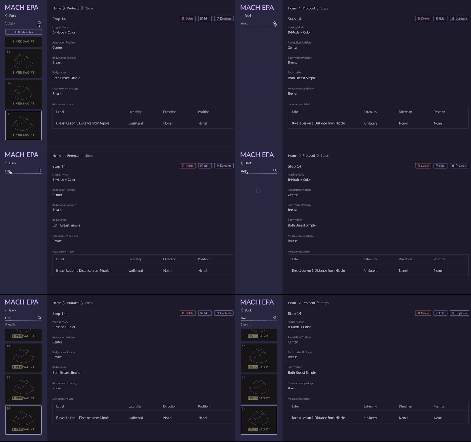
Search inside navigation
To address problems 1 and 2, I've introduced a Back button on the left navigation, providing a quick way for users to return to the protocol information. In addition, I've implemented a search function within the left navigation to streamline the process of narrowing down and locating specific steps, eliminating the need for excessive scrolling.
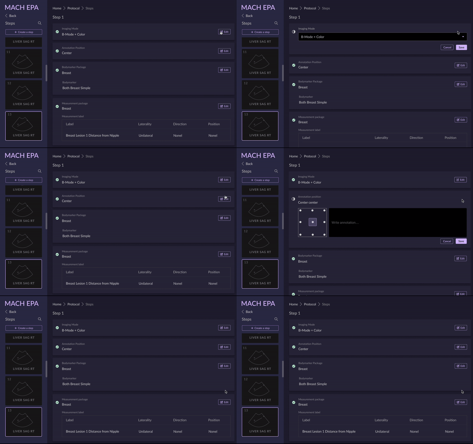
Group the form
In response to the feedback received, I've organized the form based on its content. Now, users can easily edit a specific section by clicking on the 'Edit' button associated with that part.
Key takeaways
Avoid scope-creeping features
When the project was initiated, there was an initial expectation that it would be completed within three months. However, it soon became apparent that the complexity of the products required further discussion and research. Additionally, as we iterated based on multiple rounds of feedback, various versions and scope-creeping features emerged, many of which were deferred to future releases. This led us to the decision to proceed with the Minimum Viable Product (MVP) version.
Cross-functional communication within the organization
This project necessitates extensive communication across various departments. We need to validate the design from the perspectives of developers, application specialists, and the marketing team. My comprehension of web development, encompassing HTML, CSS, and JavaScript, along with my background in marketing, has facilitated the alignment of diverse requirements and streamlined the iterative process. Incorporating these distinct viewpoints has not only broadened my outlook but also enhanced my design thinking.
Think outside the box
While addressing the feedback from Key Opinion Leaders (KOL), I discovered that thinking outside the box could guide me towards generating diverse design iterations. Surprisingly, these unconventional designs gained approval from the stakeholders. They expressed enthusiasm for the novel ideas I had introduced and expressed interest in moving forward with the implementation of these concepts.
