Build New Hire Ramp-up Experience
Role: UI/UX Design, Visual Design, Interaction Design
Team: 5 Software Engineers, 1 Product Manager, HR team, 1 Senior UX Researcher.
Challenge: Speed up a Ramp-Up Experience that motivates all employees to complete their designated tasks punctually throughout the onboarding and ramp-up processes.
Timeline: 2 months.
Project Background
What is Ramp Up experience?
Upon commencing their onboarding and ramp-up journey, new hires are tasked with a substantial number of HR-related assignments. This workflow aims to assist organizations in providing a cohesive employee experience by offering a centralized platform for overseeing their work requirements, experiences, and transitions.
Why does Ramp Up experience matter?
The experience gives new hires a great first 90 days at ServiceNow with a welcoming environment and reduce time to contribution.
Also, it enables managers to provide the right guidance and support to new hires to ensure that the right equipment is available and ready to use and help develop connections with people, strategies & places.
Roughly 69% of employees are more likely to stay with a company for three years if they experience great Ramp Up.
High level goals
🗓 Week 1
Kick off the project
As an initial step, it is essential to gather market insights. This process will aid in defining the problems, comprehending the users, and subsequently identifying potential opportunities.
Initial feedbacks from HR department
Despite the presence of an Employee Portal page dedicated to displaying all assigned tasks for new hires, each employee consistently overlooked certain tasks. This resulted in decreased efficiency and heightened costs for the company. Collaborating with the team, I embarked on an investigation to determine the underlying reasons before proceeding to the design phase.
Which personas should I design for?
Say hello to Kate
Kate is the manager in ServiceNow. She cares about her new hires, ensuring a smooth onboarding and ramp-up process, as companies with great cultures tend to be more productive and successful, contributing to higher job satisfaction.
Say hello to Michael
Michael is the individual contributor at ServiceNow. As a new hire, he needs to understand the company's values and how he can contribute to the organization. He must complete the onboarding and ramp-up tasks efficiently to be quickly assigned responsibilities.
Why are the onboarding and ramp-up designs working ineffectively right now?
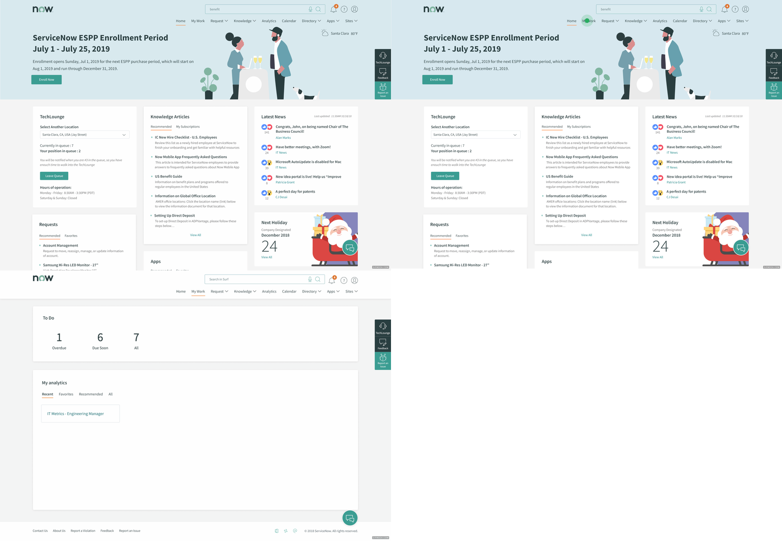
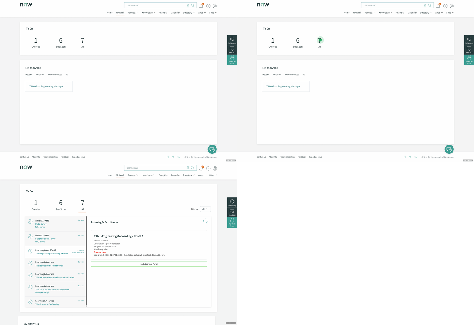
I performed a site analysis to gain a deeper understanding of the page hierarchy and evaluate the functionality of the product. I charted the user flow by tracking their journey from the homepage to the "My Work" page. Through this process, I identified areas for improvement in the information architecture (IA). To my surprise, I found that users were required to take unnecessary steps and encountered numerous challenges when attempting to access the task list.
No notifications for assigned tasks
Users were required to deduce their tasks by clicking on "My Work" without the aid of any notifications. Previously, the Portal team had integrated notifications within "My Work," but this had an adverse impact on the page's speed and performance.
Consequently, the feature was eliminated, resulting in users struggling to access their assigned tasks.
The tasks were hidden
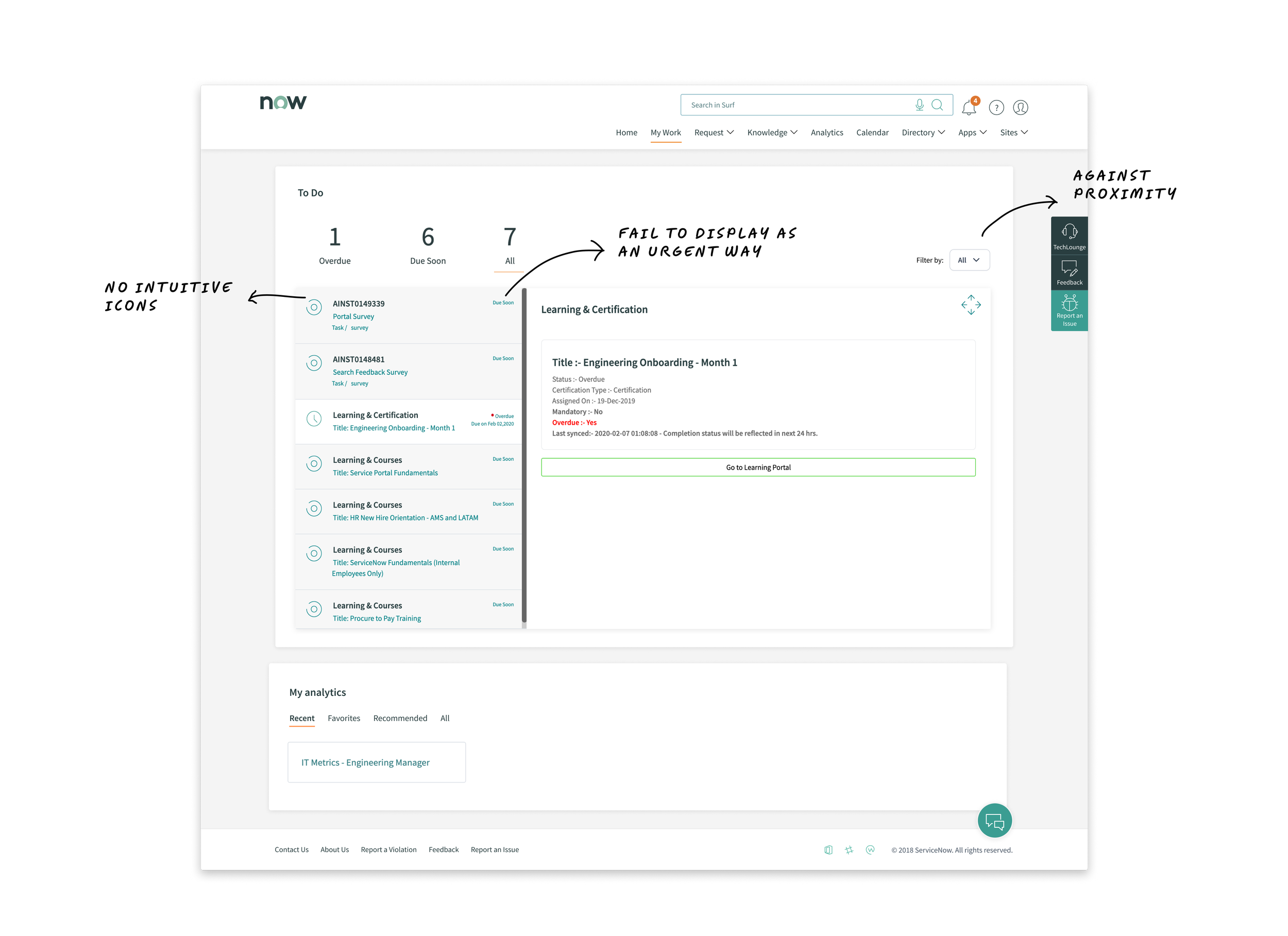
Recognizing their assigned tasks held significant importance for employees. However, users were compelled to independently determine their tasks by navigating to the "My Work" page and subsequently clicking on numbers to access each task. This process constituted an unnecessary and redundant step.
The category tasks were hidden in the dropdown
Understanding the category of each task was crucial for users to aid in prioritization. Unfortunately, the dropdown menu positioned on the far right side contradicted the principles of proximity, making it challenging to locate.
Furthermore, the "Due Soon" notification failed to display the due date for users.
Although the inclusion of icons was a positive aspect, they occupied space without intuitively conveying which tasks were due soon or overdue.
🗓 Week 2-3
Get more insights from focus group
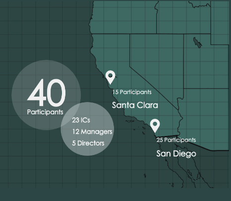
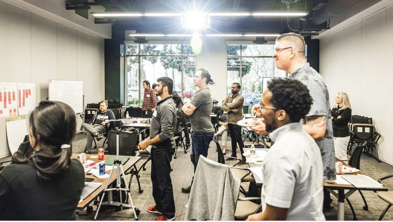
Focus groups in Santa Clara and San Diego with the intention of identifying and documenting pain points and highlights from both the IC and well as the manager perspective.
Fostering collaboration with representative from each of the 4 departments for the analysis of the findings from the focus groups.
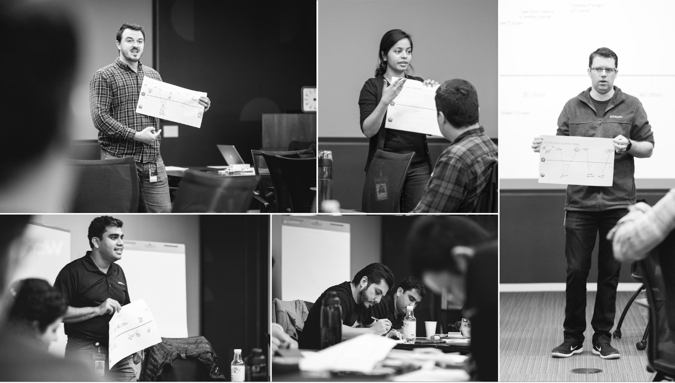
Mapping out the user journey
Based on the interview results, I mapped out the user journey spanning from day 1 to day 90. This mapping allowed me to understand the users' thoughts and emotions throughout their onboarding and ramp-up experience.
What did we see from the journey map?
We gathered numerous pain points from new hires, most of which occurred within the first 60 days. They often felt overwhelmed by the multitude of tasks and were eager to learn more about ServiceNow products, yet they struggled with prioritizing where to start.
Reframe the problems
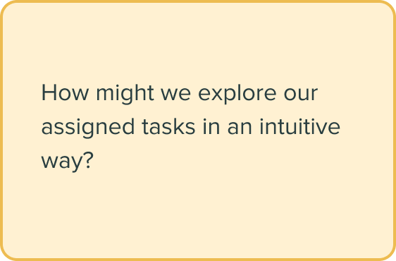
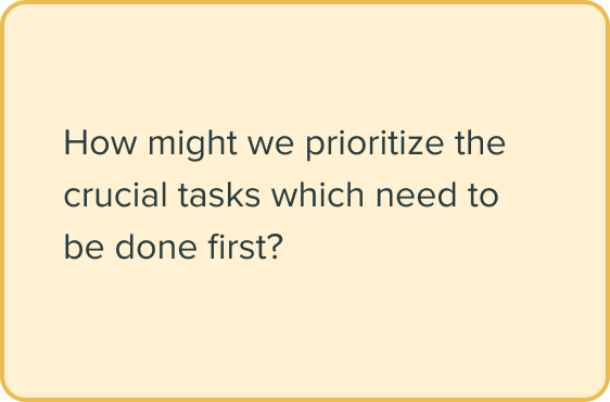
To make sure that our project was on the right track as well as the stakeholder’s goals are aligned with our design goal, I talked to stakeholders, development team and reframed the following problems:
🗓 Week 4
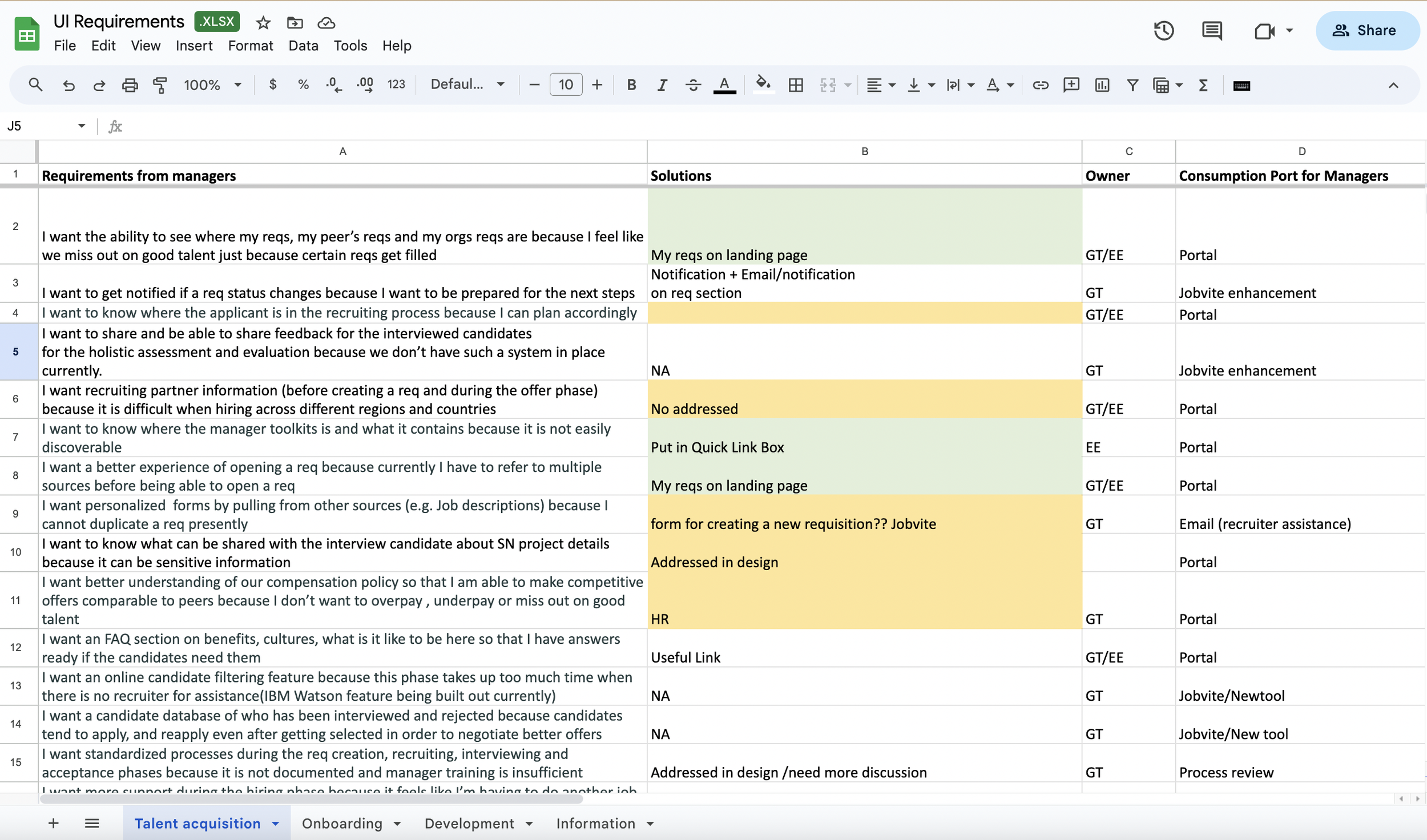
Deeply dive into the UI requirements
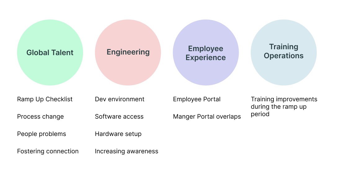
When we formulated the How Might We questions, the team convened to outline the UI requirements. Prior to this, it was essential to identify who would be addressing the cross-functional organization aspect.
Who is tackling what
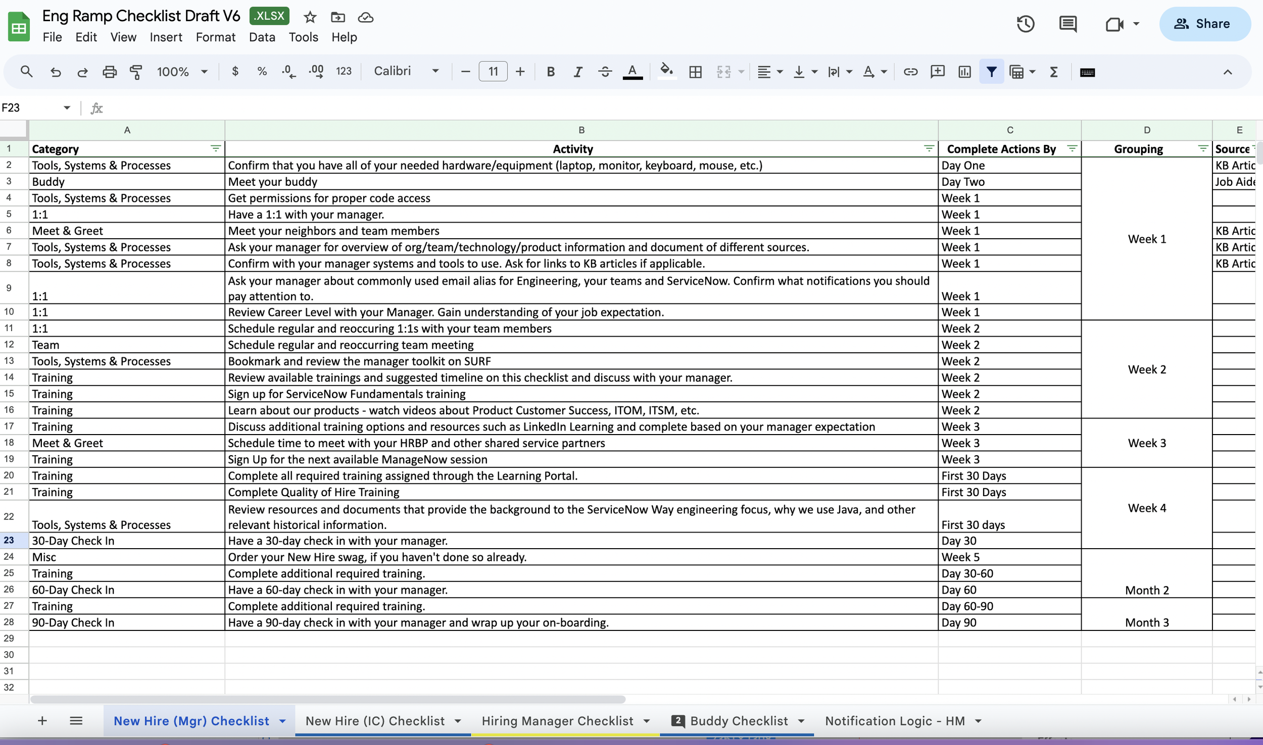
In addition to the tasks for new hires, there were also numerous tasks for Global Talent and managers.
After identifying the checklist provided by HR, we conducted a brainstorming session to outline the 90-day activities of new hires, HR, and managers. This helped us ensure that all necessary steps were designed for a smooth flow of communication among departments.
🗓 Week 5-7
Ideate different solutions
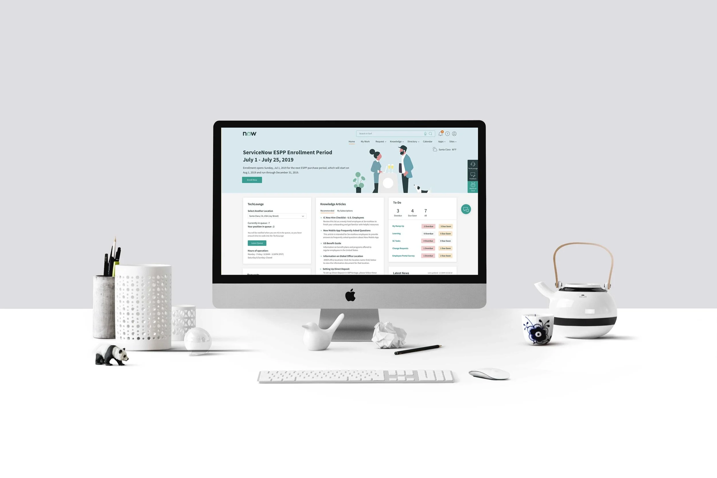
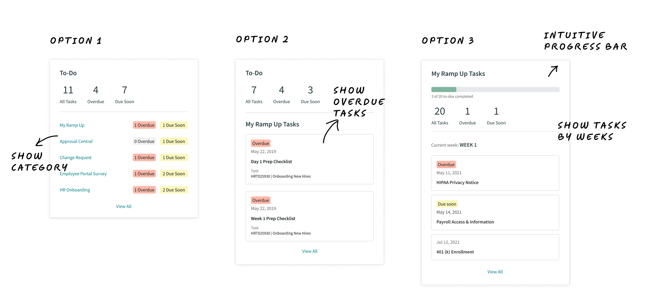
New hires: show the To-do list on the homepage
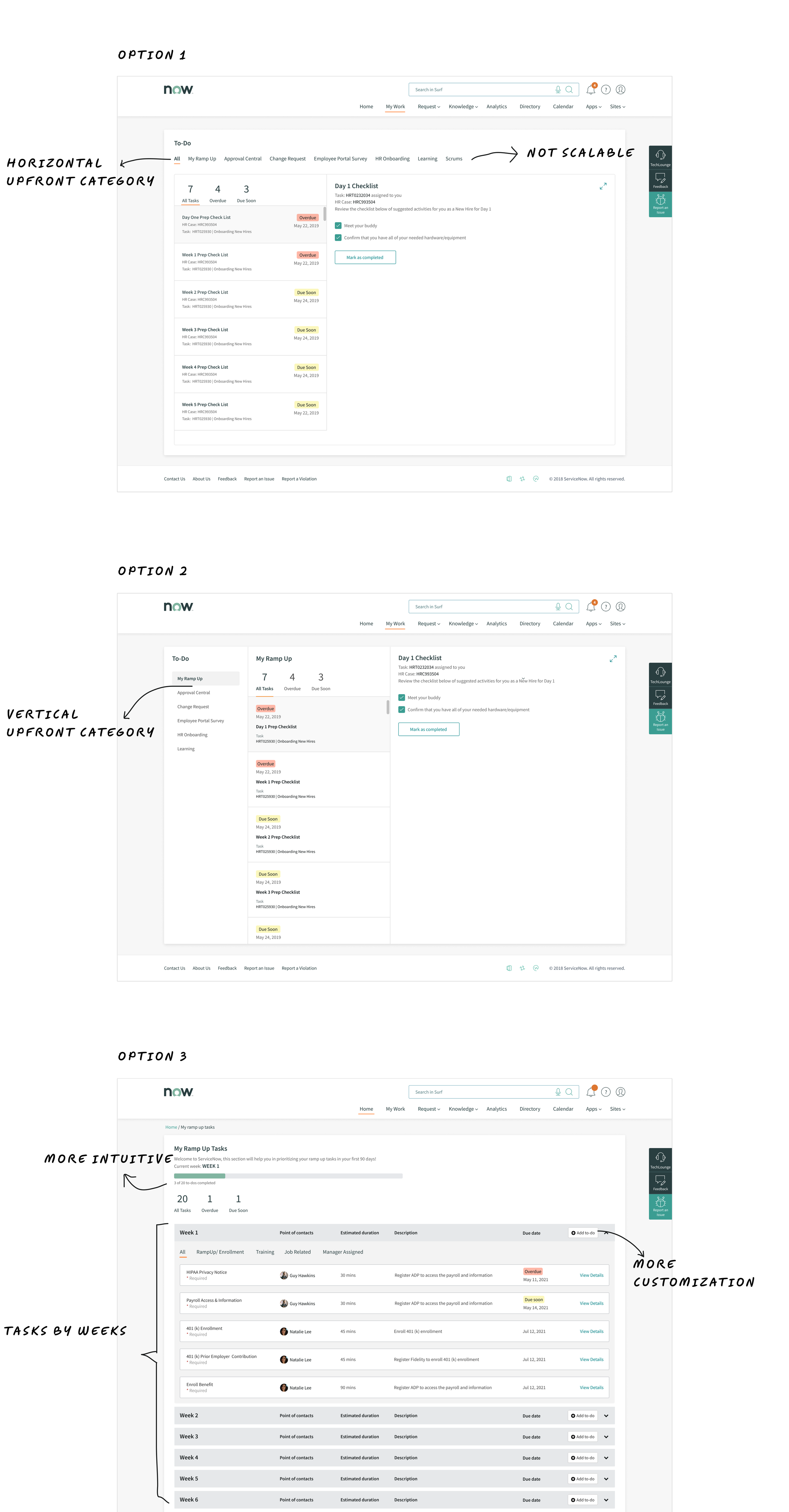
OPTION 1: Displaying the To-do list on the Homepage provides users with a quick overview of their Overdue and Due Soon tasks that have been assigned to them. This setup enables users to directly access task categories on the "My Work" page by clicking either the red or orange buttons. However, following discussions with the team, it was recognized that this approach might potentially inundate individuals with a surplus of numbers and information.
OPTION 2: present the most recently overdue tasks. While this approach doesn't offer employees a view of the overall task categories, it does empower them to address overdue and due soon tasks promptly.
OPTION 3: New hires struggled with task prioritization, so we discussed an alternative approach: organizing the tasks by weeks.
Open task categories upfront
We iterated different versions, which prominently displayed tasks without necessitating users to click on a dropdown. Additionally, I eliminated the ambiguous "Over Due" and "Due Soon" icons, opting instead for a color-based hierarchy for highlighting priorities on overdue and due soon tasks.
Let’s get ramped up!
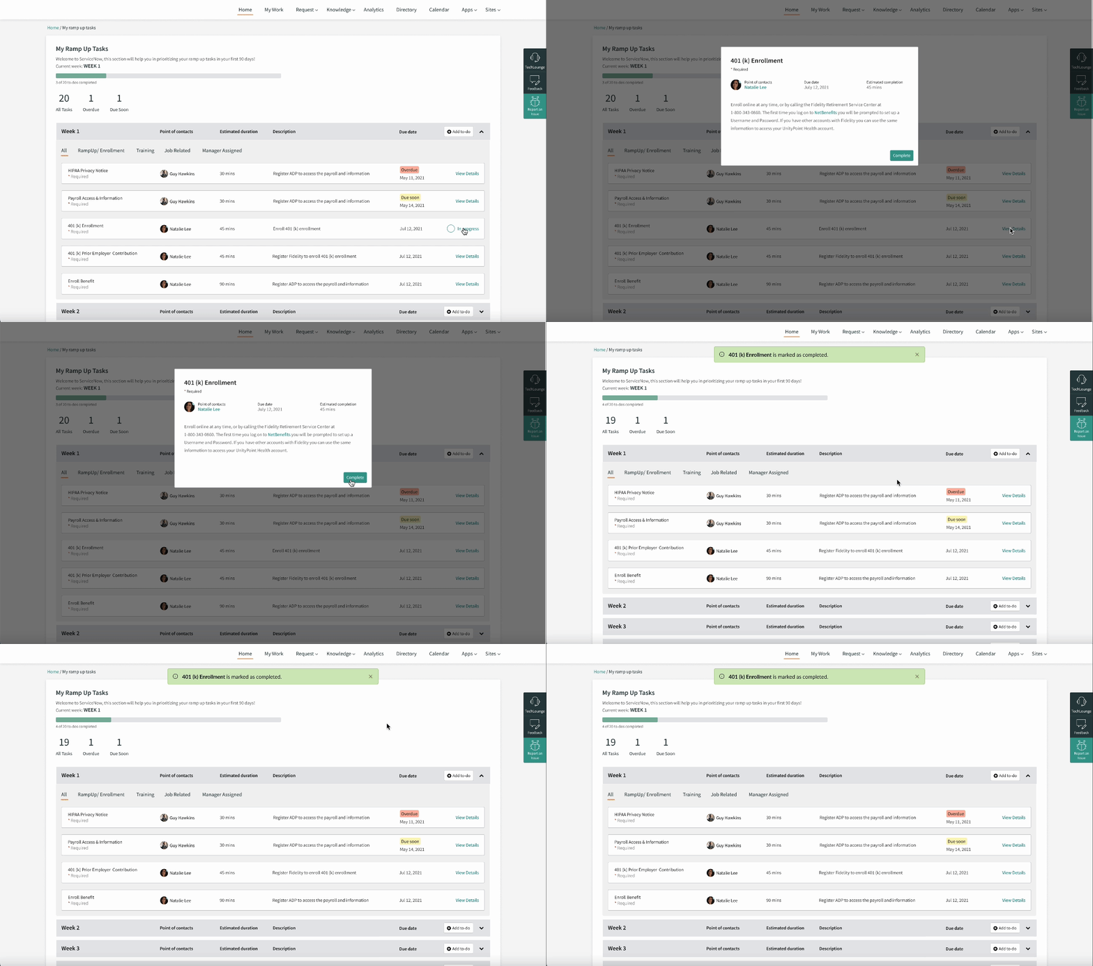
New hires log into the employee portal to view their weekly tasks widget. They can click "View all" to access the complete ramp-up task list and complete them according to the schedule.
Celebrate the milestones
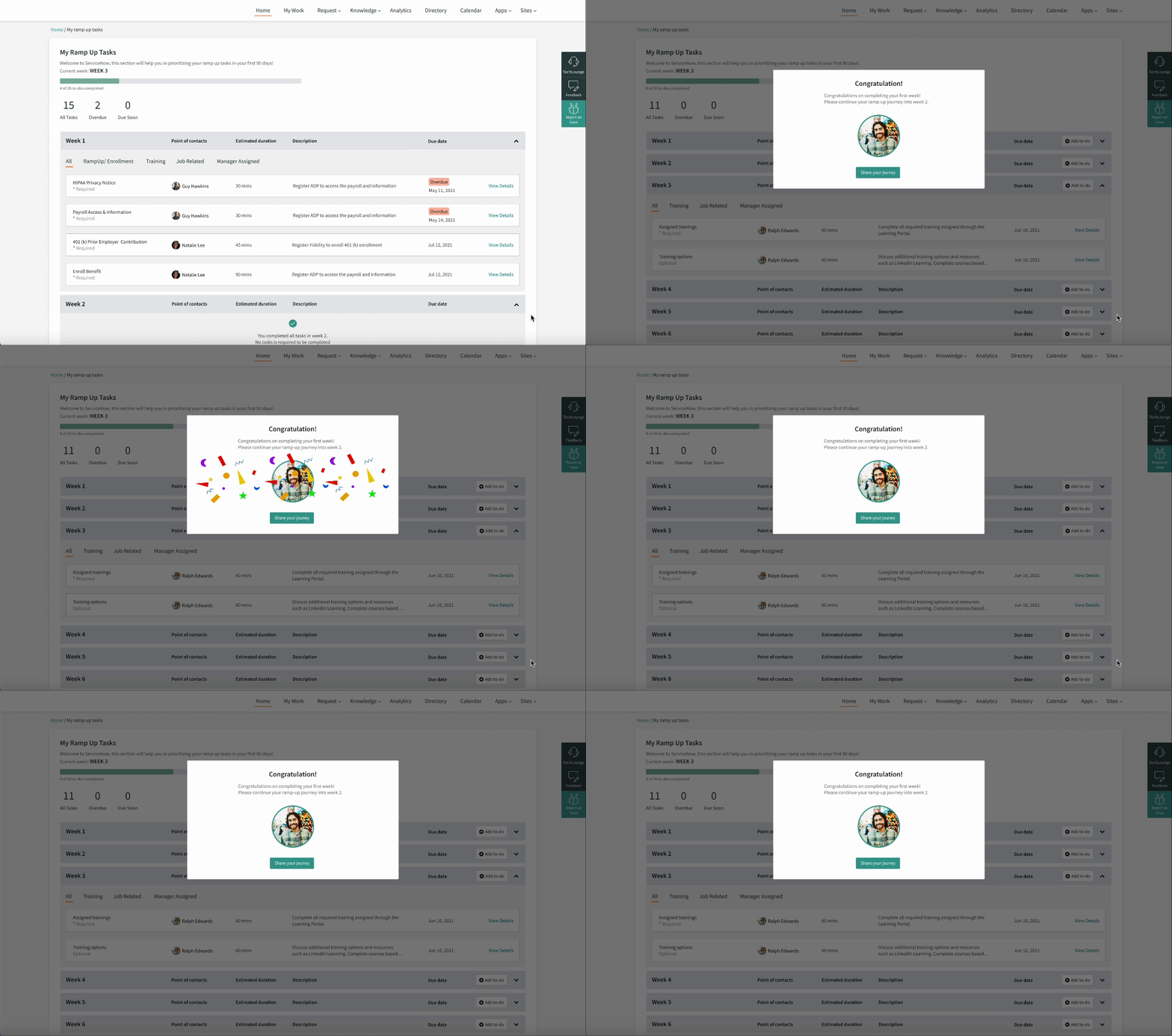
To generate more excitement for new hires, we came up the flow to celebrate the milestone of joining ServiceNow and reinforce our value proposition.
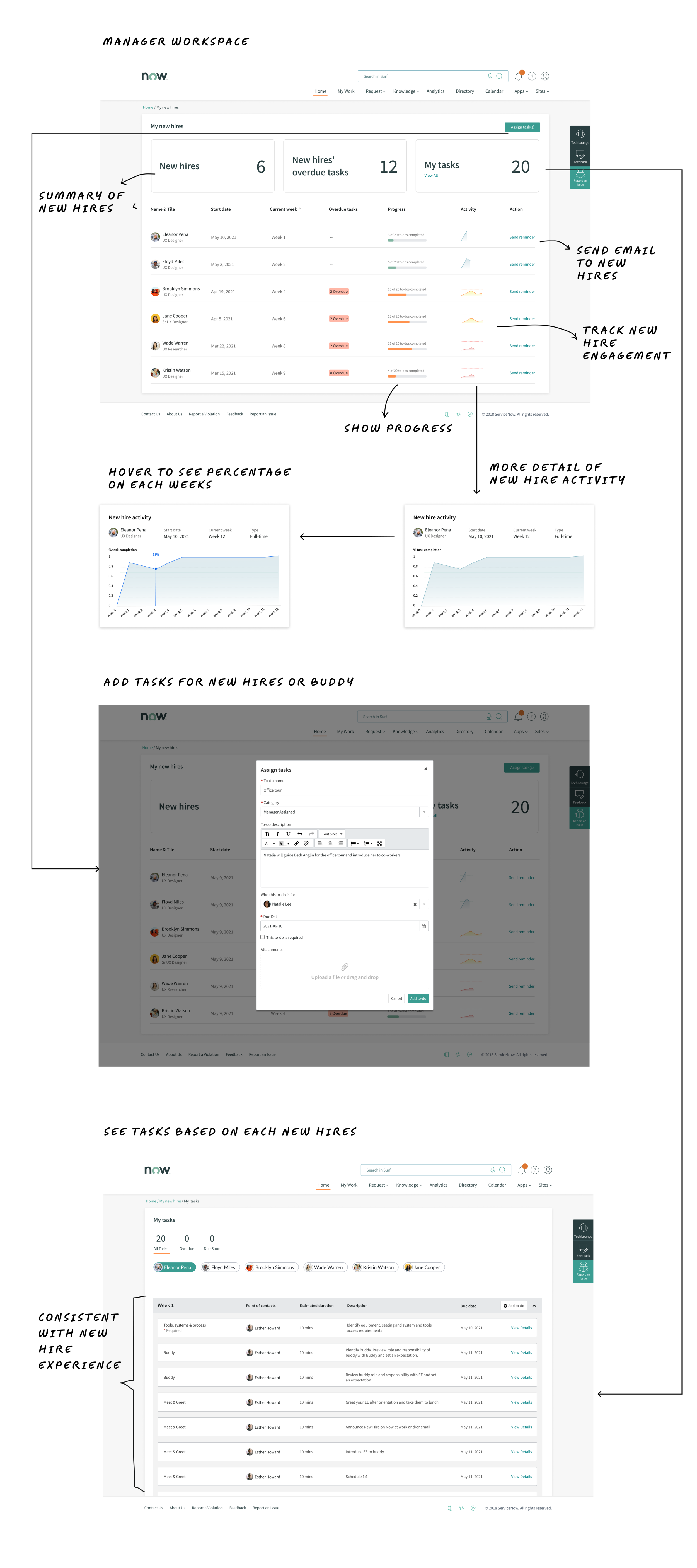
Buddy program: The manager assigns tasks for a buddy to assist the new hire
We launched the buddy program to assist in helping the new employees feel welcomed and connected during their first day, first week, and throughout their first month on the job.
Track new hires’ ramp up activity
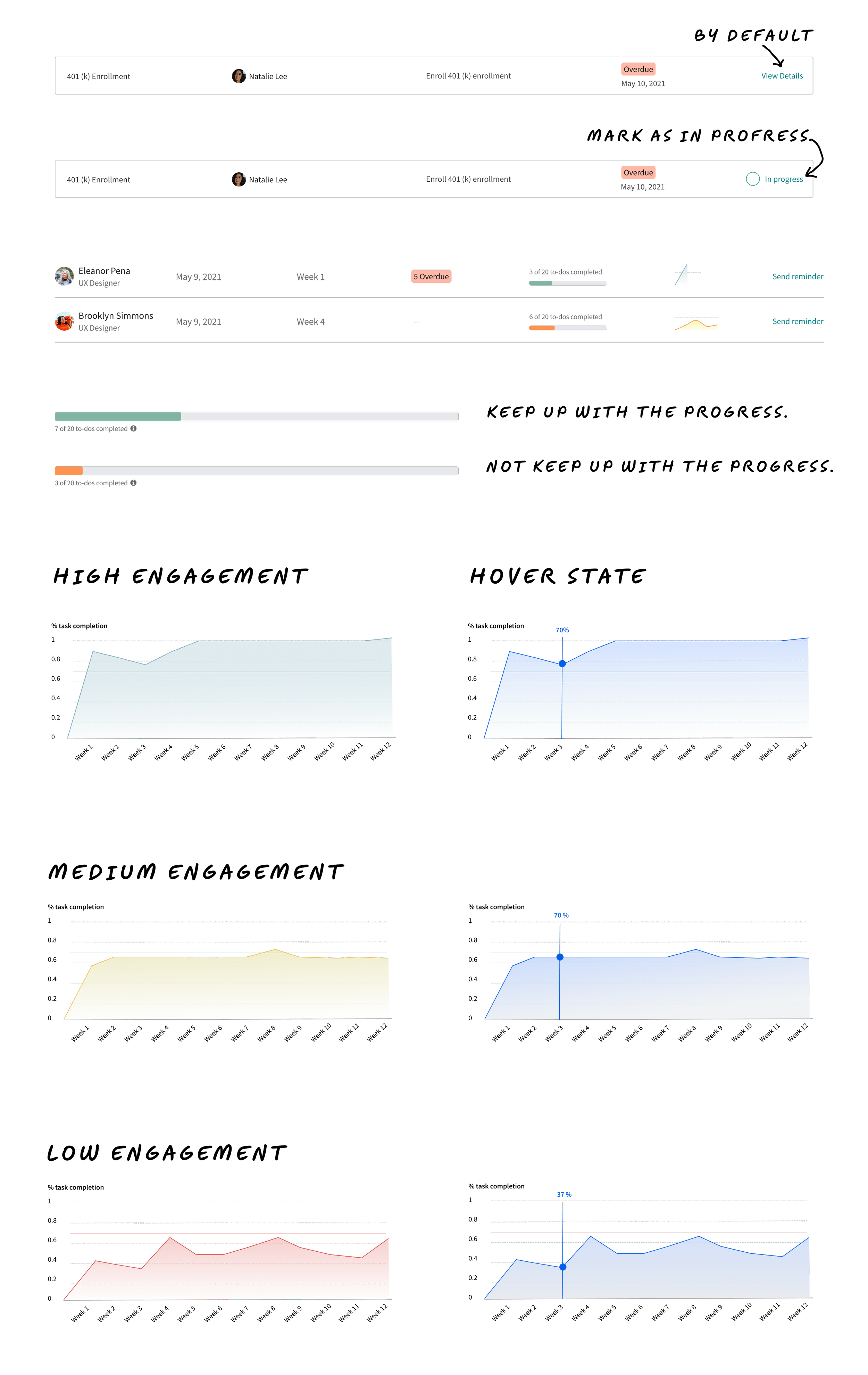
This portal assists managers in tracking the activities and progress of onboarding and ramp-up for their new hires. If there are pending tasks, managers can use this portal to send emails to the new hires.
Design for different personas with consistency.
During the collaboration, we were surprised to discover that the manager persona has additional tasks unrelated to new hires. In addition to the ramp-up tasks, managers also handle administrative responsibilities concerning their employees. Which of these tasks takes the highest priority for new hires and managers?
Additionally, for the MVP, we decided not to introduce too many complex designs due to technical constraints on the ServiceNow platform and the limited timeline. However, we wanted to keep the ramp-up experience separate from other tasks. To achieve this, we used the same 'Todo' cards and placed them side by side when additional tasks emerged.
Systemic and thoughtful design
We achieve speed and simplicity by minimizing components and enabling engineers to work quickly. A design element should be considered a component only if it has frequent and substantial usage in the overall design. If a part lacks consistent use or a primary purpose, it warrants reevaluation
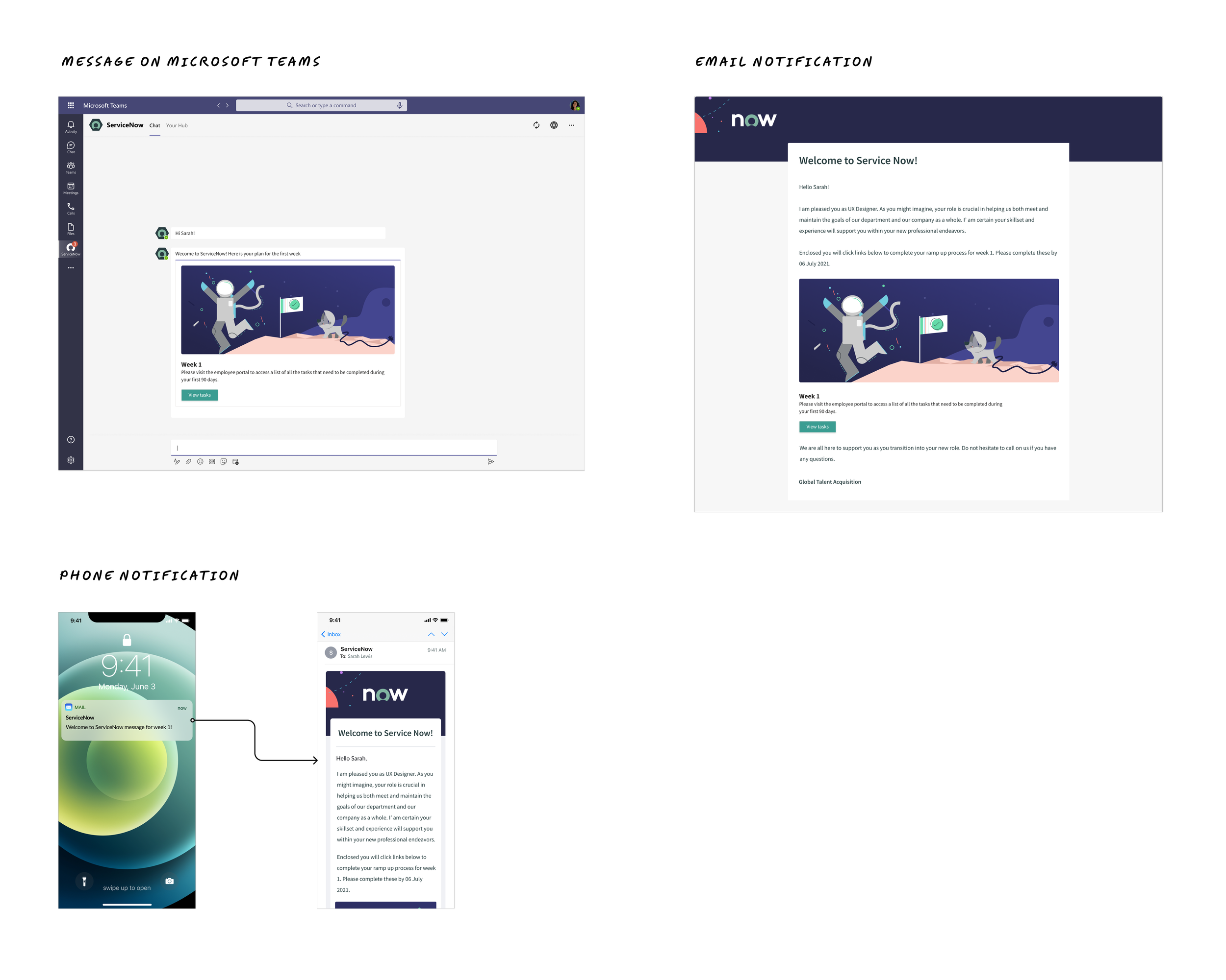
Design for notifications
To increase engagement among new hires, we expanded our notification strategy to include multiple platforms such as Teams, Email, and Phone notifications. Consequently, we also needed to design templates for the development team to use when sending out these notifications.
🗓 Week 8
Usability Testing
I facilitated the usability testing to encourage the participants to do and hear what they were thinking and observed to see the app through someone’s eyes and understand why some things that were obvious to me were confusing or frustrating to users.
Participants:
Employee who joined ServiceNow’s Product team within the recent 90 days.
Managers from the Product team who have new hires in their teams.
Feedback from new design
“My eyes were caught by those red and orange color buttons. I would first click on the red one because it indicates the urgency of processing something”
Users were able to easily identify the Ramp Up widget by seeing the numbers as the right place for completing the task.
Users also appreciated the color code scheme that allows them easily to identify the status of assigned tasks.
Key takeaways
More engagement: Ramp-up workspace increased from 5,000 to 18,000 clicks per week.
Even though I observed an increase in the number of interactions on the Ramp Up workspace, I was uncertain whether it contributed to shortening the ramp-up process for new hires, as it depends on various factors such as the managers, buddies, and HR processes. Following this project, I did not have the opportunity to work on further iterations, as I was assigned to a more prioritized project.
Lessons
Nonetheless, this project was a significant achievement for me. I learned a lot from the collaboration. This project was one of those where I felt I could deliver both speed and quality.
